POWER BI Modeling:
Summarizing Data
Changing the default summarization:
For any column of numeric data that is contained in a table there is the option to choose how to summarize this data. For instance, for the revenue column in your table, you can choose the default summarization that appears in your reports. Within any report, you can also change how you would like to summarize this data. If you have a numeric column such as revenue, you don’t need to write a separate formula to get statistical measures like average, count, distinct count, standard deviation, min, max or median. You can simply change this my clicking on the dropdown icons shown below:
To change the default summarization:
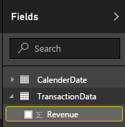
- Click on the data column you want to change in the fields menu
- Select the modeling tab at the top of Power BI Desktop.
- Select Default Summarization as shown below:
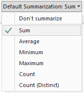
Note: This will change how the rows in your data table are summarized (i.e aggregated ). It will not change how your previous reports are displayed.
To change how your reports are summarized:
- Under visualizations, select the dropdown icon in the category you want to change as shown below:
-
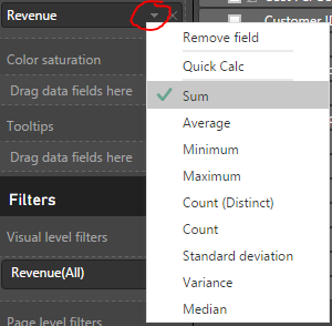
Note: You will only have these options for numeric data that is contained in a column. If this is not clear review Measures vs Calculated Columns
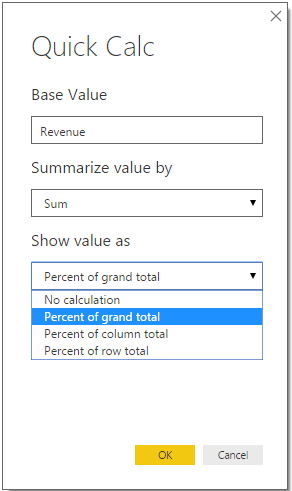
Quick Calc Feature:
You might have noticed the Quick Calc feature under dropdown options in the image above. Quick Calc is available for any measure or column that is numeric.
- Under visualizations, select the dropdown icon in the measure or column you want to change
- Select Quick Calc and choose how you want the values to be summarized
-
Power BI Demo:
This report uses the summarization options and the quick calc feature to display the % of grand total of revenue. To show both the revenue and % of total revenue, simply drag revenue into the values section twice and change one of the columns to show % of grand total using quick calc. Hovering over one of the data points in the map, shows some of the statistical summary options that are available.
The large difference between median and mean revenue is something common to all data points. This reveals the data is skewed right by some of the transactions that are very large.
Data Analyst
Tableau Consultant
Power BI
Data Analytics
Google Ads Data Analytics
SEO Data Consultant
email me at: arhoy@ualberta.ca